Every artist has their own take on the characters they draw. Sometimes that take is jarringly different from previous depictions.
That's when this trope comes in: it's what happens when an incoming artist gives a character a different appearance based on their own strengths and weaknesses, which results in any number of changes including height, build, stylization of a deformity, Artistic Age, a costume or hairstyle change, even a Race Lift. At the extreme there may be no resemblance between the two. By its' nature it usually isn't an expository change, one covered by the likes of Significant Wardrobe Shift, Important Haircut, Fanservice Pack or Magic Plastic Surgery. While editors and directors strive to smooth things out, if there is a rotation of artists, designers and animators it can make for a constantly shifting art style of what is otherwise supposed to be a serial work. Close companion to this trope is Art Evolution, gradual changes due to the learning curve of what designs and art style is working, and Art Shift, which is temporary changes typically done to emulate a particular genre.
This is especially common in comics, as the number of artists involved tend to be smaller and so switching one out will have a more noticeable change.
This trope is centered on unexplained changes and personal art styles; slight variations due to shot composition should be avoided as well as obvious Off-Model mistakes. Consider that a real person can look radically different due to expression, lighting, make-up, hairstyle and focal lenses, so examples of this trope should be several steps beyond that.
Many cases of Progressively Prettier and more than a few aversions/examples of the Most Common Superpower depend on the artist.
Compare Off-Model, Non-Standard Character Design, Historical Beauty Update, Adaptation Dye-Job, Depending on the Writer, and Inconsistent Coloring.
Example Subpages:
Other Examples:
- Before the invention of photography, the only way to preserve the features of a famous person was through a painting or drawing. Unfortunately, some artists would add their own embellishments, and in many cases (but we can't be sure of exactly which ones), the artist never saw the subject at all and based the painting on a description.
- This is very common in depictions of Biblical and mythological figures. In particular, as Christianity spreads around the world, Jesus will often be given a Race Lift in the local church to reflect the local culture. Compare this third-century catacomb painting
 ◊ of Jesus as the Good Shepherd (beardless and wearing a short tunic) with modern takes on the same subject by Gail Rein (standard Looks Like Jesus, with fair skin, light brown hair and beard, and a long robe), John Snogron◊ (a darker-complexioned version of the same), and an unnamed French artist◊ (short-haired, beardless, and black).
- Magic: The Gathering:
- The artists can't seem to reach a consensus on what Lim-Dul looks like. Dark Ritual shows him with black hair and ram's horns, his own card has him white-haired and with his horns out of the picture, and the comics draw him bald and with antlers.
- In the days before style guides were standard, this trope was all over the place. One particular example is the Ice Age and Alliance sets' depiction of the Balduvian race - on some cards, rowdy, war-painted barbarians, in others dark-skinned shamans, in others some sort of...whatever this thing is.
- Since the mid 1990's after the retirement of creator Hank Ketcham he handed off the duties of drawing Dennis the Menace to his friends Marcus Hamilton and Ron Ferdinand, Hamilton's style is more broad and detailed and he gives the characters full eyes while Ferdinand's is loose, sketchy, less detailed and gives the characters Black Bead Eyes, Scott Ketcham, Hank's son began drawing the strip in 2010 and his style is similar to Hamilton's except a bit more cartoonish.
- The main characters in Dick Tracy are drawn quite consistently, with the noticeable exceptions of Lizz Worthington and Diet Smith. Chester Gould drew Lizz as a fairly normal-looking woman, Rick Fletcher made her somewhat cuter and bustier, and then Dick Locher changed her design, making her look far more butch and less feminine. As for Diet...Is Diet winning his battle with his waistline these days? Does he have normal eyebrows or enormous ones?
- Apparently colorists are the bane of cartoonists' lives, as the cartoonists are often blamed for colouring problems. Scott Adams ran headlong into this when he did a Dilbert strip about a thieving night watchman and the colorist gave him dark skin.
- Peanuts:
- What color are Snoopy's doghouse and supper dish? Red or Yellow? What color is Charlie Brown's shirt? Yellow, right? Except when it's red. What color is Peppermint Patty's shirt? Green, except when it's purple. Charles M. Schulz chose the colors himself for the Sunday strips, putting an overlay with numbers on top of the pen-and-ink originals to correspond with the coloring guide the syndicate used, then the syndicate added the colors for publication, so most differences are on him, but there was always the risk that the syndicate might screw things up. There are also the newspapers that voluntarily color the daily strips making non-standard choices, and the animated adaptations being at the mercy of whatever the animators decide to go with on colors.
- Since Schulz's death, many of the originally-black-&-white daily strips have been recolored. These are far more likely to have such continuity errors. For example, some versions of a Peanuts strip which specifically says that this dog dish is yellow, as a plot point, shows the dish a different colour.
- Charlie Brown's shirt was originally red in the Sunday strips, but switched to yellow due to the popularity of the TV specials, which used yellow from the start. Some pieces of merchandise have used orange, blue or green, and a rare few even changed the color of the black zigzag.
- Schulz also varied in his depiction of Franklin's skin tone. In the Sunday strips he colored it brown, but in the dailies he originally used diagonal lines. Later on he switched to using Zipatone dots on Franklin in the dailies.
- What color are Snoopy's doghouse and supper dish? Red or Yellow? What color is Charlie Brown's shirt? Yellow, right? Except when it's red. What color is Peppermint Patty's shirt? Green, except when it's purple. Charles M. Schulz chose the colors himself for the Sunday strips, putting an overlay with numbers on top of the pen-and-ink originals to correspond with the coloring guide the syndicate used, then the syndicate added the colors for publication, so most differences are on him, but there was always the risk that the syndicate might screw things up. There are also the newspapers that voluntarily color the daily strips making non-standard choices, and the animated adaptations being at the mercy of whatever the animators decide to go with on colors.
- This problem also messed up a The Far Side cartoon with a bunch of penguins and one of them singing "Me, I just gotta be me." The joke is that the penguins all look the same, but one colourist made the singing penguin yellow instead of black and white, ruining the irony. Gary Larson admitted to liking the other version on its own merits.
- Mike's friend Lawrence in For Better or for Worse is meant to be mixed-race (his father being a black Brazilian). Depending on the colorist and Johnston's own style, he varies between being darker-skinned or appearing as white as Mike.
- In Garfield, the house and Jon's clothing have no set color palette. In one set of strips Odie is briefly adopted by a little girl (during a storyline where he and Garfield get lost in the city). In the first strip where she appears, she's colored like this.◊ In subsequent strips, she's colored like this◊. This is because the dailies were colored by different people than Sunday strips, which are intended for color printing. The dailies were only colored years later for a collected edition.
- Being a fan-made transformation of Bowser from Super Mario, Bowsette doesn't really have a defined appearance. Most artists stuck with her original depiction in ayyk92's comic as a Cute Monster Girl version of Princess Peach in a dark dress and some of Bowser's traits, some made her into a Fiery Redhead like the real Bowser, some darkened her skin, some do both, and that's not getting into tendencies of invoking Buxom Beauty Standard and/or Amazonian Beauty and the Stripperiffic outfits she wears, or even if she's even wearing the Super Crown.
- While the vast majority do stay true to a few character traits of the Happy Tree Friends characters, such as color schemes and accessories, the countless artists that have contributed to Happy Tree Friends: The Anime have all depicted the cast differently, with clothing, hairstyles and physiques constantly in flux.
- Murdle fanart provides a very interesting example. The cast is never given proper descriptions, with all we have to go on being their physical stats (eye color, hair color, height, etc.) and, in the books, their icons (which often depict accessories or hairstyles)—but because of those icons, as well as the fact that most of the cast has color names and fan artists coordinate them accordingly, Murdle fandom is an experience where two people can have almost completely different designs for a character and yet both are still recognizable as the character.
- The art style varied greatly in the An American Tail movies. The only two with similar animation styles are the direct-to-video sequels, and Tanya still somehow managed to look completely different in both movies (she's the character who goes through the most extreme design changes from movie to movie).
- Lilo & Stitch (2002): During Jumba's attack on Lilo's house, and during the rescue of Lilo from Gantu, there's a few scenes mixed in where Jumba looks much shorter and pudgier than normal.The reason for this is because both scenes had parts in them that had to be redrawn by a different studio later. The attack scene had parts redrawn because it was originally found to be too violent when it was intended to be comedic, and the rescue scene due to the 9/11 attack.
- The Little Mermaid: When animated by Glen Keane, Ariel is drawn and animated more intricately, especially in her face and hair.
- Bill Justice drew the Lost Boys from Peter Pan (1953) with elvish features such as pointier ears on their costumes, buck teeth, and small button noses, while others such as Wolfgang Reitherman and Fred Moore drew them in a cartoonish manner.
- Pinocchio (1940): In scenes animated by Woolie Reitherman, Pinocchio's nose is slightly longer, and Jiminy's hat always seems to be drooping to one side.
- Snow White and the Seven Dwarfs: In his book The Fairest One of All on the making of the film, J.B. Kaufmann points out that Snow White's expressions and body language subtly change from scene to scene, depending on which of her two main animators is handling her. In the scenes animated by Hamilton Luske (e.g. when she runs through the forest, or in "Whistle While You Work") she's more wide-eyed and childlike, while in the scenes animated by Grim Natwick (e.g. when she teases Grumpy, or in "Someday My Prince Will Come") she's a slightly more sophisticated young woman.
- Son of the White Horse was animated both by Pannonia Film Studio veterans, including the director Marcell Jankovics himself, and the low ranking animation staff who reportedly had a very hard time following the film's art style. Animation quality varies a lot, with some scenes having fluid, dynamic animation with detailed characters, well defined anatomy and weight, while others have rough, choppier and weightless animation with simplified character models and minimal facial expressions. The director has stated he was disatisfied with at least 20 minutes' worth of animation.
- This is discussed in American Splendor, when Joyce isn't sure what the real Harvey Pekar will look like, since some artists have him looking like a young Marlon Brando while others represent him like an ape with stink lines.
- Discussed in Revealing Casper, a documentary about the making of the 1995 film. Animators put a lot of their own expressions into their characters, but they didn't want to make it obvious that Casper was animated by at least five different people.
- Godzilla has had many, many different designs◊ over the years. As multiple costume designers and eventually CG artists have given him different looks meaning Goji's scales, spines, height, mass and eye colour is often drastically different from film to film. Some go for a Darker and Edgier look in homage to the orignal, while others go for a more Lighter and Softer making Godzilla look more cartoonish like in the 70s era.
- For most of Space Jam, the Looney Tunes cast resembles their 1950s/Chuck Jones designs. However, in a sequence animated by David Spafford (the scene where they take Michael to their gym to practice), they look more like Bob Clampett's designs.
- Star Trek:
- Each film of the Original Series movies features a different bridge design for the Enterprise. Generally the same layout but with a different color scheme or style of bridge consoles. It is possible to explain via an upgrade, but is less likely in Star Trek III: The Search for Spock as it's supposed to be an Immediate Sequel to Star Trek II: The Wrath of Khan and the Enterprise was scheduled to be retired. It's also noted by fans that while the refit shown in Star Trek: The Motion Picture justifies the changes, there is enough cosmetic alterations both internally and externally that it could barely be considered the same ship afterwards.
- Previous TNG-era films used a number of Recycled Sets from both the TNG show and the other spin-offs of the era, redressed a little to be slightly different. Star Trek: Nemesis was filmed after the spin-offs had ended and many of the sets torn down (and Star Trek: Enterprise was a prequel that heavily clashed with that era's design scheme). This resulted in a number of completely new locations that didn't resemble anything previously shown. Most notably Star Trek: First Contact had the Enterprise-E sickbay as a redress of Star Trek: Voyager's sickbay with a different lighting scheme and swapped consoles. Nemesis shows a different sickbay entirely different.
- The Abrams-produced films of Star Trek (2009), Star Trek Into Darkness and Star Trek Beyond featured numerous cosmetic changes to the Enterprise itself. Since it was a CGI model and not a physical model, such things were much easier to tweak. Beyond, featuring a different director, had some major structural changes to the nacelles and deflector dish in order to highlight a particular action scene.
- Lone Wolf:
- Darklord Gnaag's appearance between Book 8 and Book 12, which is primarily due to the change in illustration artists. The Updated Re-release changes his appearance further, again due to a new artist.
- Gwynian the Sage is hardly recognizable in illustrations between his first appearance in Book 4, and his later one in Book 8.
- The Chaos-master's illustrations in Grey Star's series and then in The Prisoners of Time are also wildly different, but here it's completely justified in-story, since the Chaos-master is an Eldritch Abomination who keeps changing shape all the time.
- The graphic novel The Skull of Agarash is mostly faithful to the illustrations provided in the gamebooks, notably for the various Darklord minions and monsters, with the exception of Banedon's Dwarven crew, which are depicted looking more like goblins than the classic bearded dwarves.
- What the main character of Coraline looks like depends on the illustrations. Her hair is usually varying shades of brown but sometimes it's black. The shading used in the books implies she has black hair as well. Her hairstyle is typically something of a bob haircut but the original illustrations have her with a shoulder length style.
- When Paul Kidby replaced Josh Kirby as the cover artist for Discworld, he brought in not just a different style, but also significant changes to the appearances of some characters — most notably Rincewind, who was depicted by Kirby as an old, Gandalf-like mage with a long white beard (see the Sourcery cover for an example), but in Kidby's interpretation◊ is clearly younger and sports just a short, brown goatee. It's been acknowledged that Kidby's interpretations are much closer to Pratchett's descriptions of characters than Kirby's. (Kirby had a notoriously free attitude to interpreting the books.)
- Verse from the Elancia Chronicles saga looks noticeably different between the Cover art & interior illustrations. In the former, she has a longer, animalistic snout, bright pinkish-red hair, and vibrant magenta-ish fur. In the latter, she has a somewhat flatter face, blood-red hair, and a dull bluish-purple fur. The interior illustrations match her descriptions from the text more closely, due to the interior artist being more directly involved with the author.
- The Railway Series: Due to not being based on a specific locomotive class, and thus lacking reference materials, the different illustrators seemed to have their own ideas about what Percy should look like. The most notable differing feature is the shape of his saddle tanks.
- Sesame Street picture books:
- Before a Muppet version of Grover's mom was constructed for the show, artists drawing for the books apparently don't agree with how she should look. Depictions range from an old lady to a young mother. Tough Pigs takes an extensive analysis on this one.
- Likewise, before Elmo's parents appeared as Muppets on he show, different picture book artists drew them with different hairstyles, but nearly always portrayed them both as looking just like grownup versions of Elmo. When they finally appeared on the show, however, father Louie had the same red color as Elmo but a different head shape and brown hair, while mother Mae was a light orange monster with purple hair.
- Before a Muppet version of Grover's mom was constructed for the show, artists drawing for the books apparently don't agree with how she should look. Depictions range from an old lady to a young mother. Tough Pigs takes an extensive analysis on this one.
- Ben Skywalker. His hair is officially "flame-red" but has been depicted as reddish-brown◊, sandy blond◊, brown◊, and fully blond◊. The faces don't entirely match up, either.
- Older Than Feudalism In Hinduism, the goddess Kali is sometimes depicted with a mouth full of fangs, bulging eyes, and a really long tongue. Others give her a pretty face, but, being the goddess of destruction, she's still a Terror Hero.
- MAD tends to have different takes on mascot Alfred E. Neuman depending on who drew that issue's front cover, but most artists stick closely to more polished variants of the design codified by Frank Kelly Freas and Norman Mingo early in the magazine's history. However, other artists have given him their own spin—Sergio Aragonés's takes are very cartoony and sketchy, Mort Drucker's are more jagged, Jack Davis's very loose and energetic, and Al Jaffee's are more chunky. Drew Struzan's only cover is extremely Off-Model with a very different haircut. James Warhola and Richard Williams usually painted their covers, thus giving them a little more muddy retraux feel like the Mingo and Freas covers of old. This has generally been averted from the early 2000s onward, as an overwhelming majority of the covers are drawn by Mark Fredrickson, a digital artist who sticks closely to the established style.
- Dungeons & Dragons gets this a lot.
- The worst victim is probably the Demon Lord Demogorgon; the consistent part of its appearance is that it has two animalistic heads and tentacle arms. Its bulk, amount and color of hair, skin texture, number of tentacles (varies between one and two on each arm), arm structure, and the species of the animals its heads are has varied over the years, between hyenas, baboons, and mandrills. Link◊, link◊, link◊, link◊, link for the most recent rendition◊. and another link◊.
- Demogorgon's main rival, Orcus, spent a lot of 3rd switching back and forth between tough and muscular and morbidly obese. Nonetheless, he's been pretty consistently described as the fattest of all Fat Bastards.
- Mordenkainen, The Archmage of Greyhawk goes back and forth between Ambiguously Brown in one image◊ and almost sickly pale in another◊.
- Before 4th edition Dungeons & Dragons, all Tieflings (the result of interbreeding between humans and demons) looked different, with the only constant being that there was some physical sign of their non-human heritage. Fourth edition standardized their appearance in theory — now all Tieflings have horns and tails — but artists vary widely in how human their faces look, whether their horns are curled like ram's or stick straight up (and whether that's random, consistent, or varies by gender), whether their tails are thin and flexible or thick and ungainly like a dinosaur's, etc.
- Beholders are a very interesting case, where the variations between artists have ended up becoming a plot point. Beholders have a basic description: a floating sphere with a central eye and a fanged mouth, as well as ten stalk-like eyes atop the body. However, the many artists representation led to extreme variability in colors and looks. How big/small and/or sunken is the eye, how large is the mouth and in what shape, whether the skin is chitinous or scaled or spiky, how long/thick are the stalks, where they connect and whether they are snake-like, tentacle-like or crustacean-legs-like, not to forget how comical or horrific the overall appearance is, all have depended greatly on the artists over the years. In the end, starting with the Spelljammer setting, this extreme variability has become canon, and has led to Beholders being portrayed as rampant racists: all Beholders that deviate too much from a specific one are considered hideous mutants by said individual, whose own form is the one and only pinnacle of the species, and are only good for extermination.
- The worst victim is probably the Demon Lord Demogorgon; the consistent part of its appearance is that it has two animalistic heads and tentacle arms. Its bulk, amount and color of hair, skin texture, number of tentacles (varies between one and two on each arm), arm structure, and the species of the animals its heads are has varied over the years, between hyenas, baboons, and mandrills. Link
- Ironclaw occasionally crosses into this with recurring characters. For instance, as an anthropomorphic fox, Amalsand Jakoba has been depicted (sometimes in the same comic) with and without hair.
- Sajan Gadadvara, Pathfinder's iconic monk, is supposed to be from Golarion's equivalent of Southeast Asia. He usually looks less Southeast Asian than some variation on the theme of Ambiguously Brown.
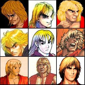
- This was a recurrent problem in early BattleTech, particularly with the appearances of the titular 'Mechs, especially the Unseen. Take a look at any three Phoenix Hawk drawings, and all of them will differ fairly significantly from one another and from the Macross VF-1S Valkyrie, from which it is derived. Some artists made spot-on Macross reproductions, while others gave the PHX a bulbous round head.
- In Warhammer 40,000 the God-Emperor of Mankind has been depicted in various states of mummification after becoming a Dark Lord on Life Support, ranging from an almost living corpse in a sitting position◊ to a giant skeleton with wires hanging out of it◊ (the latter being the more popular interpretation).
- BIONICLE had this so much, that eventually the writer simply came forward and said that everyone is free to choose which kind of character design they want to see as "the most real". Thankfully in some cases, like for the shape-shifting race of beings called Makuta or the Mask of Life, most of the variations were canon-justified. Though a lot still had to be chalked up to the occasional Unreliable Illustrator, or artists not being supplied with sufficiently clear guidelines.
- Sla'ker in Turtles of Grayskull has three-fingered hands like Slash and the Ninja Turtles. But some of the character art on the toy's box depicts him with five-fingered hands like Faker.
- Etra chan saw it!:
- Akane, Azami and Tsutsuji can wear either pants or skirts depending on the artist drawing the episode.
- Most episodes use the stock chibi art in text bubbles when characters are out of view, though some artists will draw unique faces.
- Paranormal High School: The series has multiple artists working on it, with the art style for a video changing depending on which of them worked on the story at the time. The general character designs are fairly consistent, beyond school uniform colors (Riko could be wearing a standard blue blazer or a pink sweater, as an example), and Special Episodes generally keep the same artist for the entire thing, but characters can veer more realistic or cartoony depending on the video.
- There are some inconsistencies regarding Blake in RWBY. Nobody can agree on whether or not her usual outfit leaves her belly button exposed or not, her shorts sometimes have a button and zipper on the crotch but usually don't, and her feline ears are colored purple in the first season but black everywhere else.
- Broken Telephone has 18 different artist teams (one for each chapter), some of whose styles are radically different than the others'. Due to this, there is a bit of confusion when one character appears in different chapters. Lao, in particular, is the one that seems to give the readers the most fits, exacerbated by the fact that the bandage on his arm appears in a different place in each chapter.
- Abstract Gender went through several different artists, each with their own style and character design. One of the biggest problems with the comic was that even the individual artists couldn't keep the character designs constant.
- Deviant Universe: Given that anyone can join in and take part, the quality of art between artists varies A LOT.
- Gender Swapped went through this, the new artist's change in style made the characters look completely different.
- Each page of Heroes Unite is drawn by a different artist, and each artist has their own style. This can cause characters to change appearance during the same scene.
- Character designs can vary quite a bit in Homestuck, as there are multiple people doing the artwork and no model sheets. For example, they can't seem to decide whether Jane is skinny, Hollywood Pudgy or actually fat; or whether Equius is lean or heavily muscled.
- The regular characters in Lightning Made of Owls are drawn by the different contributing artists in all sorts of ways. Sometimes they're highly realistic, sometimes they're stick figures. Sometimes they're not human.
- Living with Insanity. When Paul Salvi became the artist, he redesigned all the characters so that the only ones who look like they did when David Herbert drew them are the goth girl Sally and Afro guy.
- Exploited in Melonpool, suggesting that Lyman and Uncle Max (two notable Chuck Cunningham Syndrome characters) are actually the same character.
- Sonichu does this and it only has one artist. Christine Weston Chandler's artwork is completely unrefined that everyone has a different look, but the character illustrated with the least amount of consistency is Christine herself◊.
- Sonic the Comic – Online! has several different artists and there are no design guidelines. The artists differ on whether they use the SegaSonic eye colors (green eyed Amy, blue eyed Tails, purple eyed Knuckles) or Fleetway-canon colors (brown eyed Amy, brown eyed Tails, blue eyed Knuckles). Most artists use the lanky, modern Sonic design however some use the "classic" design, as in the official comic Sonic used his classic design with green eyes instead of getting a total redesign for Sonic Adventure.
- The Unofficial Spider-Man Newspaper Strip has two different artists presently, Xavier Rojo and Eli G, due to Eli being a big time fan of Spider-Man: The Animated Series, the art style on their strips shifts in favour of reflecting the look of that show for the characters.
- The NPCs on Gaia Online vary in appearance depending on who is drawing them. Sometimes the eye color, body type, or overall "look" is different.
- Jenny Everywhere intentionally encourages this — she's an open source superhero with a very vague description, so anybody can interpret her anyway they wish. The most common interpretation has her wearing aviator goggles and a scarf, and the official description calls her "Native American or Asian."
- This was the case for Day Out with Thomas events in the UK back in the 1990s and 2000s. At the time, every British heritage railway that hosted the event had their own approach to Thomas, with his appearance often going from being mostly show-accurate, to having little resemblance to the tank engine. The other engines are even less consistent than Thomas (see this gallery on the Thomas Wikia for just how crazy it was). Justified, as Thomas and his friends are often just the railway's regular engines dressed up as them. Beginning in the 2010s, Mattel would clamp down on this and enforce stricter guidelines for the railways to follow, so it isn't as common as it once was (at least for Thomas). This is averted in the American events, which all use replicas of the show-accurate one operated by Strasburg Railroad.